
ARTH is a digital app for investment recommendations focusing on Technology sector stocks. Role: Product Designer User Research, Interaction, Visual Design, Prototyping & Testing

www.flowbase.co
UI Design
Development
Testing & UX
Independent Investors are actively seeking research-based stock market investing recommendations - multiple types of analysis, data-driven, on-demand, and handy.
ARTH is a digital app for investment recommendations focusing on Technology sector stocks. It performs Artificial Intelligence-based research and combines technical, fundamental, and economic analysis into one coherent product to bring you investment ideas with the most potential!
I am the UI/UX designer for developing ARTH
I support design across every aspect of our business and am responsible for leading UX and UI across key parts of the application side of the platform.
I've grown tremendously in the last year, some key achievements of which I have listed below:
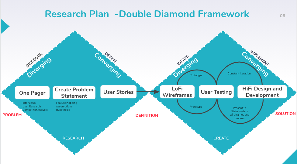
My process is based on the Double Diamond Theory and Lean UX process. I aim to incorporate the key phases of Discovery, Definition, Ideation and Implementation in all of our projects.
I conducted research interviews to learn about how individual stock investors use digital tools to select technology stocks for investing. This helped me to uncover any pain points that they were experiencing with the apps offered by competitors.
My research encompassed:
After collecting the recordings from the user interviews, I conducted affinity mapping to synthesize the pains identified. We grouped these problems under common themes and features in the platform.
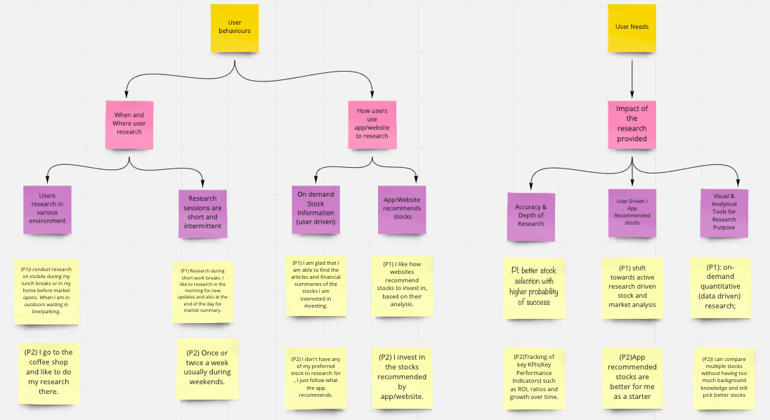
“I like to spend 15 - 20 mins researching stocks when I finish my lunch or waiting in parking line. It is a nice mental break in the middle of the busy work day.” - Participant 1
“I usually read articles on one website and then after selecting the stocks read about their financial analysis on another website. I then check a third website for market analysis of the selected stocks by running a report in excel. Finally based on my judgement call I decide whether to invest in the stock or not.” - Participant 2
I relied on approach known as the value vs complexity quadrants to inform my process and list usability issues in order of priority. The framework helps to prioritize the features based on the following variables:
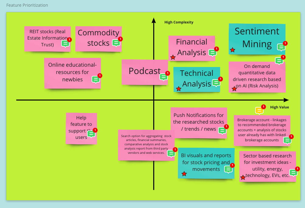
Based on the above problems identified, I worked towards addressing these pains by coming up with potential solutions:
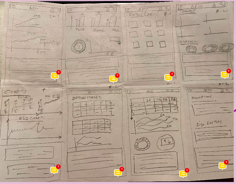
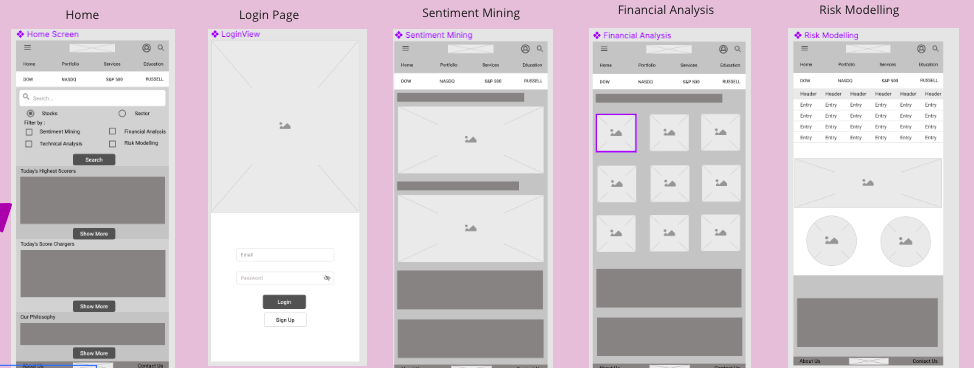
I quickly mocked up some basic wireframes to gather feedback from Product, Engineering and the users on the overall layout and structure of the wizard form. This involved establishing a standardized visual hierarchy and layout for the future wizard component.
I conducted usability testing sessions with our primary users to validate whether the new designs would solve their problems.
During the session, I observed how they interacted with the prototype. The usability session revealed that it was less arduous to search for stock recommendations based on different sectors. It was easier for the user to identify the unique features, as these were presented using cards as well as were available under collapsable menu.
I created my high fidelity mockups in Figma and then imported them into Zeplin to allow the engineers to inspect the file and export the HTML and CSS code.
I worked very closely with the Front End team to spec out any missing interactions that were not covered in the high fidelity mockups. I conducted a UX review of each front-end ticket that was implemented to ensure it was aligned with the designs.
