PROJECT

Maynooth

Maynooth is an online e-commerce furniture website. It is built on the basis of embarking on strategic, people-centric design processes, using key design tools like the journey and empathy mapping. In this project, I worked closely with the founder and a small team of engineers to build the vision.

outcomes

UI Design

Development

Testing & UX

the challenge

Background

To build a e-commerce website for people to browse & purchase furniture for home delivery. I joined Maynooth as a product designer when it was just a small team of the founder, 1 engineer and myself. I led the product, marketing, UX and UI strategy for the team. I've been extremely fortunate to have part of this journey and have grown tremendously during my time at Maynooth, some key achievements of which I have listed below:

  • Turned an idea into a product. The ability to transform an idea into something much more tangible is a process that is both exhilarating and rewarding. I worked closely with the founder and team to shape the product vision and strategy of Maynooth. While the product is still in development and has not yet been released to the public, being able to see how much we have grown as a team and startup is truly sensational.
  • Juggled many different hats. Working in an early-stage startup is not easy. I dedicated hours of my spare time and weekends conducting research, sketching, testing and designing the product.

Understanding the problem

I conducted research interviews to learn about how buyers use digital tools to select furniture for their home and office spaces. This helped me to uncover any pain points that they were experiencing with the apps offered by competitors.

My research encompassed:

  1. Understand our primary target users, who they are, their goals and needs
  2. Current furniture selection methodology used by customers and identify any gaps : to Isolate main ‘pain-points’ that our users face
  3. Quantify differentiating features for a winning product strategy
  4. Determining the success of the tasks measured
Target Audience:

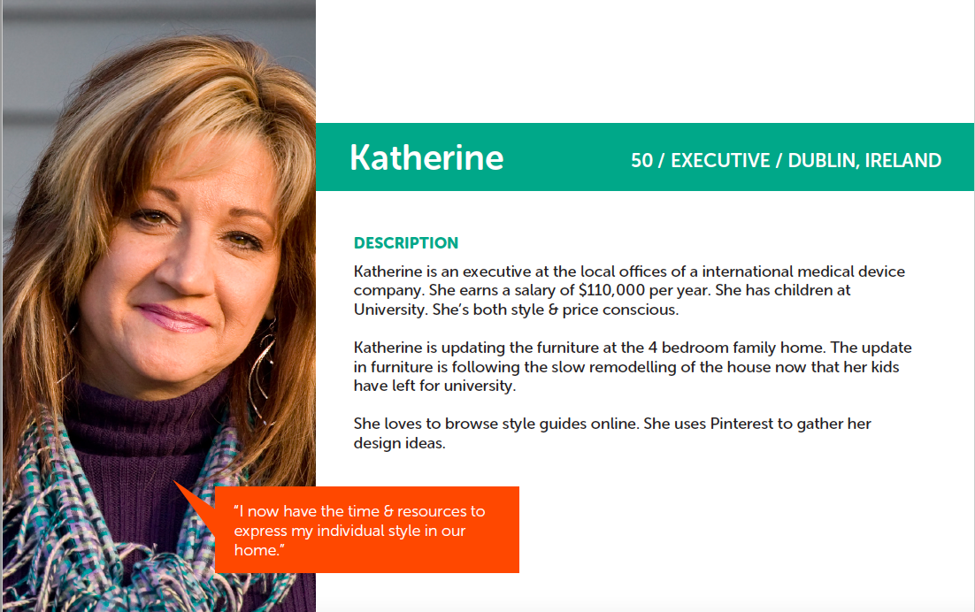
Based on our research, we recognised that there were 3 key user types that our product tried to solve problems for. We decided to focus on Persona 1 since their need was greatest and we could reach them.

User Persona
Competitors & Product Inspiration

     - https://www.worldmarket.com/

      - https://www.potterybarn.com/

Mood-boards Created:

Feature List (Product requirements)

Homepage:
  • Logo
  • Nav
  • Living Room
  • Bedroom
  • Kitchen & Dining
  • Shopping Basket
  • Contact
  • Search Box
  • Hero Slider
  • New in store
  • Inspiration Ideas
  • Clearance Deals
  • Footer
Category Page e.g. Living Room:
  • Most popular
  • Full product listings
  • Reorder by:
  • Size, Price, Name
  • Inspiration Ideas
Product Page e.g. 3 Seater Sofa:
  • Description
  • Dimensions & Details
  • Price
  • Available colours
  • Add to cart
  • In situ
  • Similar/related products
Deliverables
  • Wireframes for client approval.
  • High fidelity prototype.
  • User Testing - We’ll be using Hallway testing & unmoderated remote testing.
  • UI Assets for developers.

Wireframes:

Designs (Website & App):

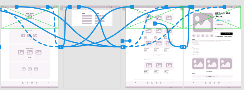
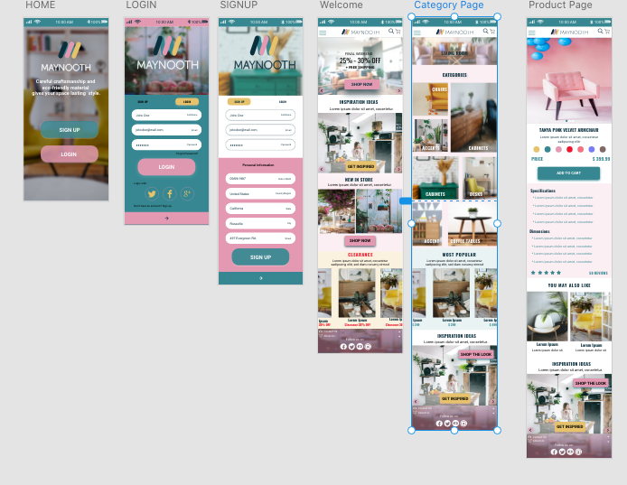
User testing was an iterative process that was conducted at every milestone of the project to identify the biggest pain points in the current version. Once feedback was gathered, I would revisit the prototypes and test again.

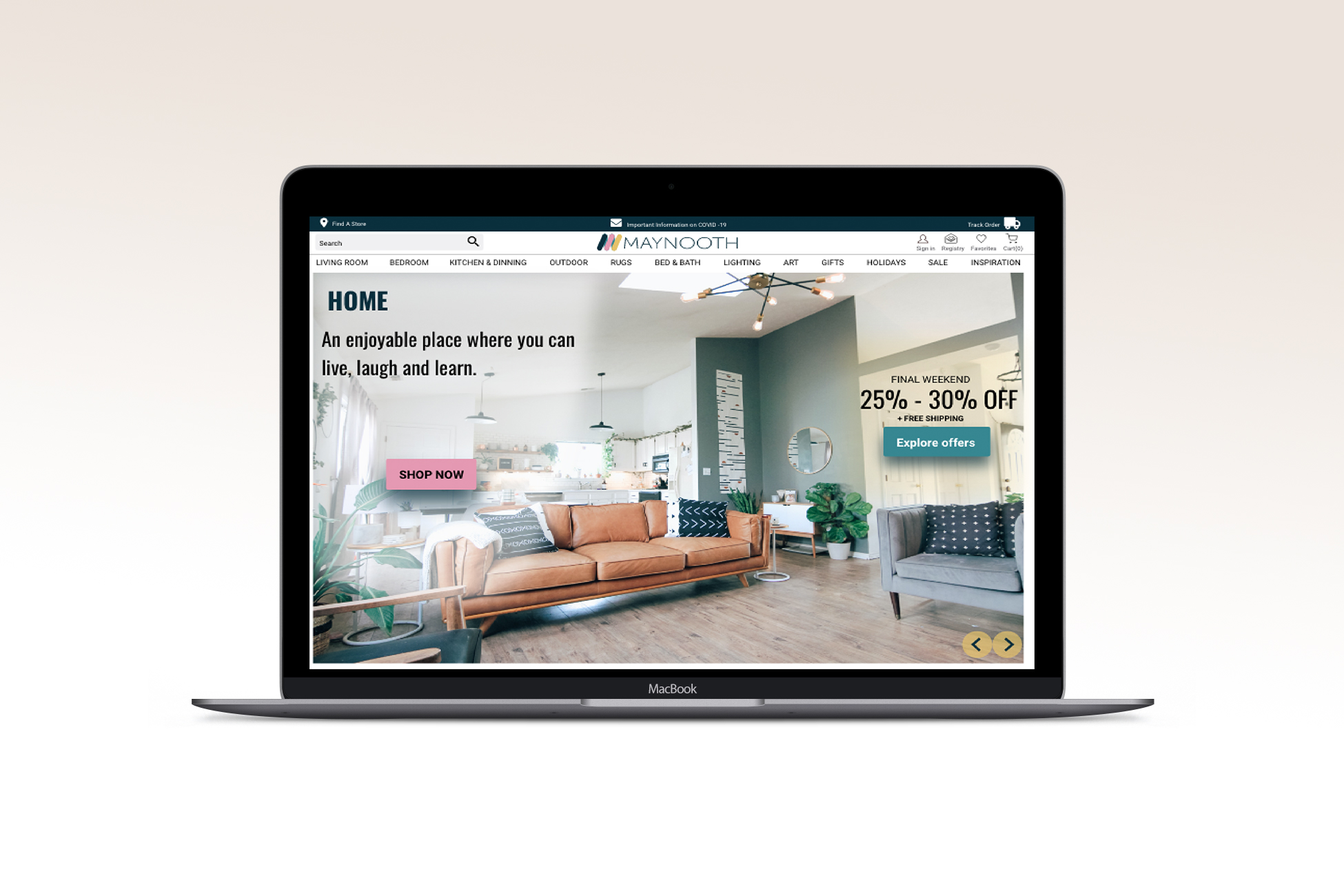
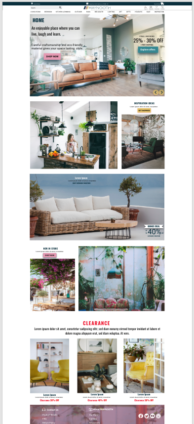
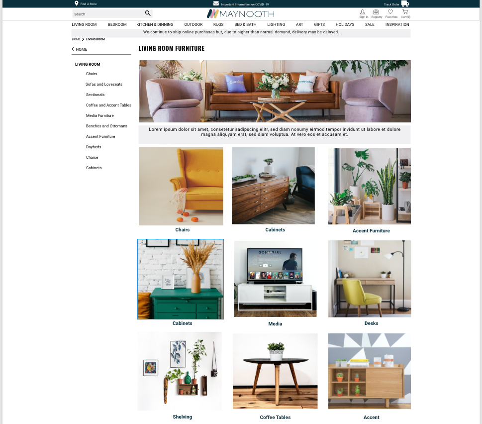
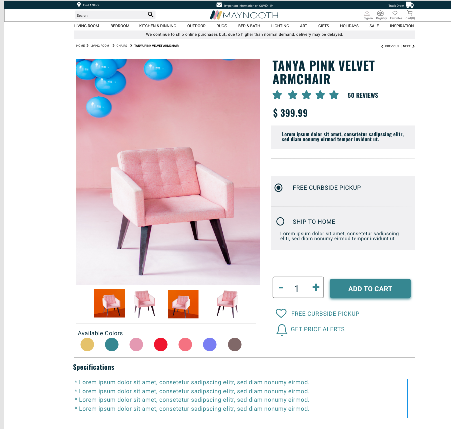
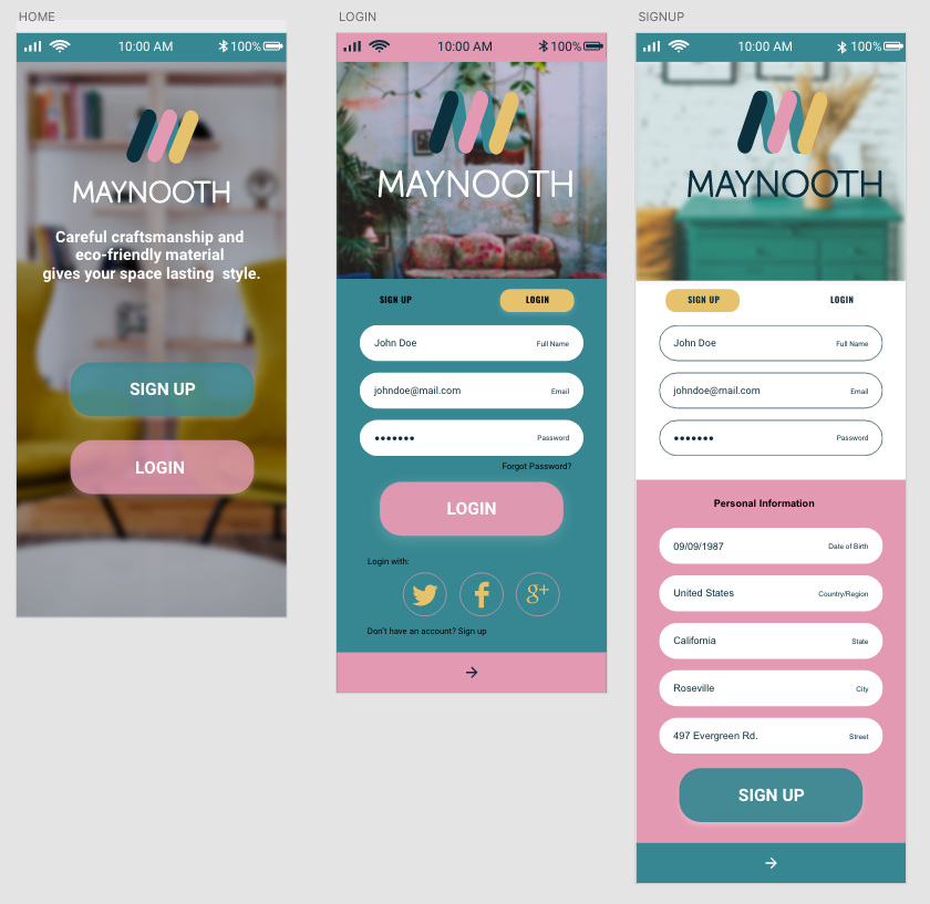
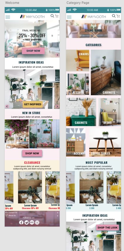
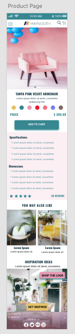
For the brand, I wanted to create a refreshing, minimalist and clean UI that conveyed trustworthiness and progression for future-oriented individuals.

Website: Landing page

I wanted a landing page that had a simple call-to-action (CTA) that conveyed our purpose and value to our target users.

Website: Category page

Website: Product Page

Mobile App: Sign up page

Mobile App: Landing  & Category Page

Mobile App: Product Page

Mobile App: All Screens

Working with developers

I worked closely with a team of 6 engineers to develop the designs for MVP. I scoped out tickets for the front-end engineers with user stories and product requirements.

Results and takeaways

Working in an early-stage startup was an extremely steep learning curve. It was an eye-opening experience that taught me a lot about being lean and knowing when and where to focus your energy and efforts.

Some key takeaways from this project are:

  • Focus on building an MVP. It's important to focus on the features that can deliver the highest value for your users.
  • Don't worry too much about the detail. Earlier in my journey, I made the mistake of worrying about the look of the UI. Taking a step back and reassessing the user flows helped me to reprioritize the UX.
  • Focus on the problem. At the end of the day, it is your users pains that you will be solving for so keeping that front of mind is important as it's easy to lose sight of this when you're bogged down in the day to day.